Our Digital Brand Book helps our partners represent Austin Parks Foundation. Consult these guidelines when creating or using photography, videography, social posts, blogs or graphics for/in partnership with APF. Here are some helpful tips:
In 2014, APF started fresh with a new look and tagline to reflect our efforts—a depiction of a hummingbird and the tagline “People Plus Parks.”
The hummingbird is the perfect depiction of APF’s spirit and is well known for being exceptionally nimble. Likewise, APF strives to be a nimble organization serving the community and working daily to respond to the unique needs of each of Austin's parks. With the wide gap between what our parks need and what our parks department can afford, APF must be quick to respond to challenges as well as spot and take advantage of opportunities.
The hummingbird is also a great pollinator, and symbolizes our role in spreading new ideas and positively contributing to Austin’s park ecosystem in order to develop and maintain parks, trails, and open spaces in Austin.
In addition to the hummingbird logo, the tagline, “People Plus Parks,” perfectly summarizes the APF mission. With nearly 300 parks, Austin Parks Foundation’s job is not always easy, but each year, with the help of our community, we are able to generate millions of dollars in volunteer time, donations and support for the places that make Austin, Austin - our parks.
Austin Parks Foundation’s logo should be used in Emerald when it’s possible to print using Pantone colors or for online applications. When the printing option is offset CMYK or digital, please use the Prussian Navy version.
White or black versions may also be used, but Emerald Green and Prussian Navy are always preferrable. Approval is always required before materials are printed, published or otherwise used for public view.
Additionally, there are some rare instances (such as Groundbreakers) where alternative lock ups of the badge may be used, but these will be provided to you if needed. Do not create other lock ups. Always provide print-ready examples for approval before publishing.
Email us at marketing@austinparks.org for approvals and questions.
Use the primary APF logo lockup as the preferred option for brand and marketing applications – particularly online depictions of the brand.
Emerald Green

Prussian Navy

Use the secondary APF logo lockup on merchandise and in branding materials where there is sufficient space available for its use.
*Use the Emerald Green version of the logo for printing with Pantone colors and online applications. When the printing option is offset CMYK or digital please use the Prussian Blue version of the logo.
Use this logo lockup when APF is the beneficiary of a project, event , product, etc.

Use this logo lockup when APF is the primary partner and/or has invested significant resources into the project, event, product, etc.
Use this logo lockup when APF is the primary partner and/or has invested significant resources into the project, event, product, etc.

The APF badge and the hummingbird inside should never be separated. The badge is not to be used alone except in rare instances when the brand will be represented in full elsewhere. ONLY Little Hummingbird Society materials may use the hummingbird outside of the badge.


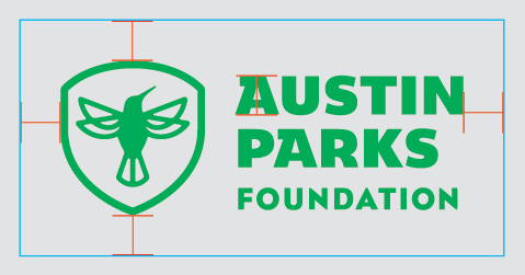
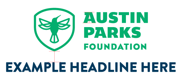
To ensure the APF logo has consistent, optimal legibility and prominence, an area of clear space should be maintained around the logo. This distance should, ideally, be equal to or greater than the height of the A in Austin Parks Foundation at each of the furthest reaches. See below for examples.
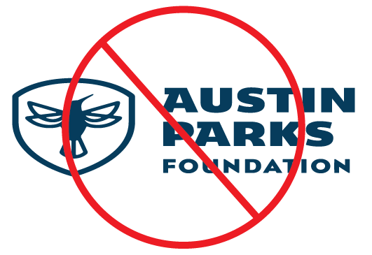
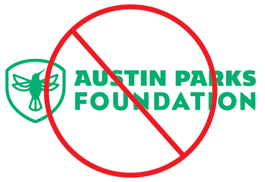
In order to maintain brand consistency the APF logo may not be re-stacked, stretched, transformed or used in any other colors than Emerald, Prussian Navy, and in rare instances, white or black.
Now that you know how to properly use Austin Parks Foundation's logos and logo lockups, download our logo package below!
The APF tagline can be used in conjunction with the logo lockups or alone. When used in a logo lock up or on social media as a hashtag, “plus” should be written out in text. When the tagline is used alone the “+” symbol may be used in place of the full word.


Recommended for the majority of uses where the tagline and logo are both used.
Alternate option that can be used when the logo is the sole hero on a page or merchandise application.
*Use the Emerald Green version of the logo for printing with Pantone colors and online applications. When the printing option is offset CMYK or digital please use the Prussian Blue version of the logo.
Emerald + Prussian Navy should be used for all applications of the logo, and as the dominant colors in all marketing materials.
Pantone 302 C
Pantone 302 U
CMYK: 100/48/12/58
RGB: 0/59/92
HEX: #003B5C
Pantone 7480 C
Pantone 7480 U
CMYK: 90/0/93/0
RGB: 0/191/111
HEX: #00BF6F
*Where possible, avoid printing the Emerald Green as a CMYK build. It will not reproduce as vibrant or as bright as the Pantone color!
Pantone 130 C
Pantone 129 U
CMYK: 0/32/100/0
RGB: 242/169/0
HEX: #F2A900
Pantone 7416 C
Pantone 7416 U
CMYK: 0/72/70/0
RGB: 229/106/84
HEX: #E56A54
Pantone 3115 C
Pantone 3115 U
CMYK: 59/0/14/0
RGB: 0/193/213
HEX: #00C1D5
To convey the positivity and vibrancy of both our parks and the APF brand, we often use multiple colors from our color palette together. Below are suggested combinations and some to avoid. In general, Prussian Navy is used in place of black and is used as our dark neutral. White may be used in combination with most of our colors, but legibility is paramount.
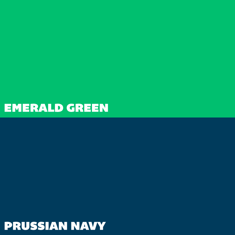
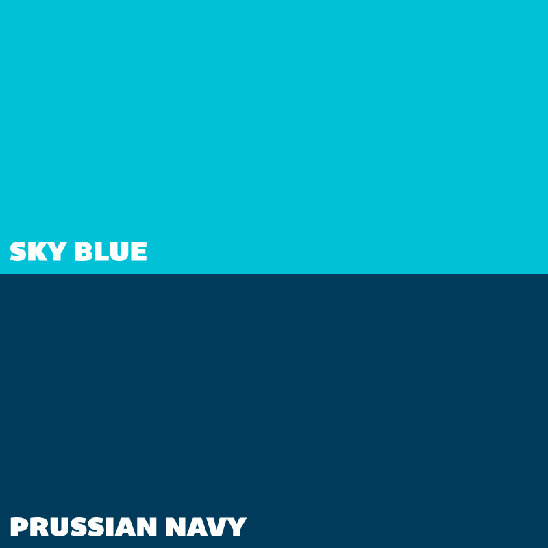
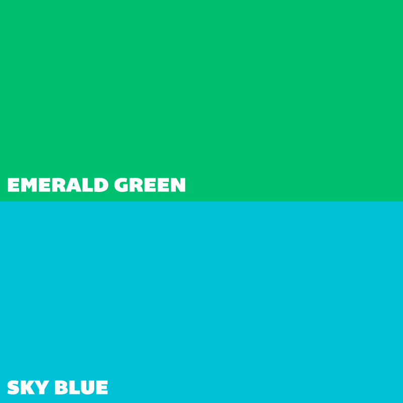
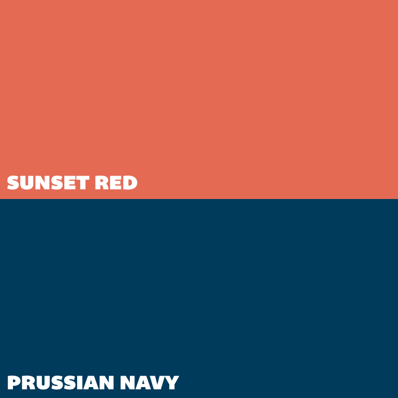
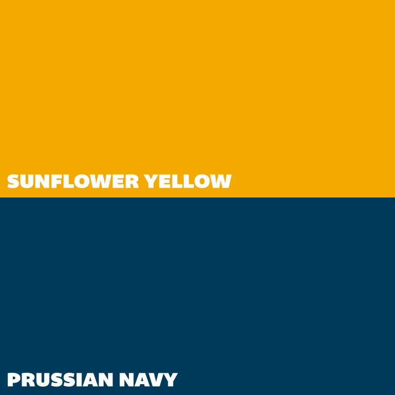
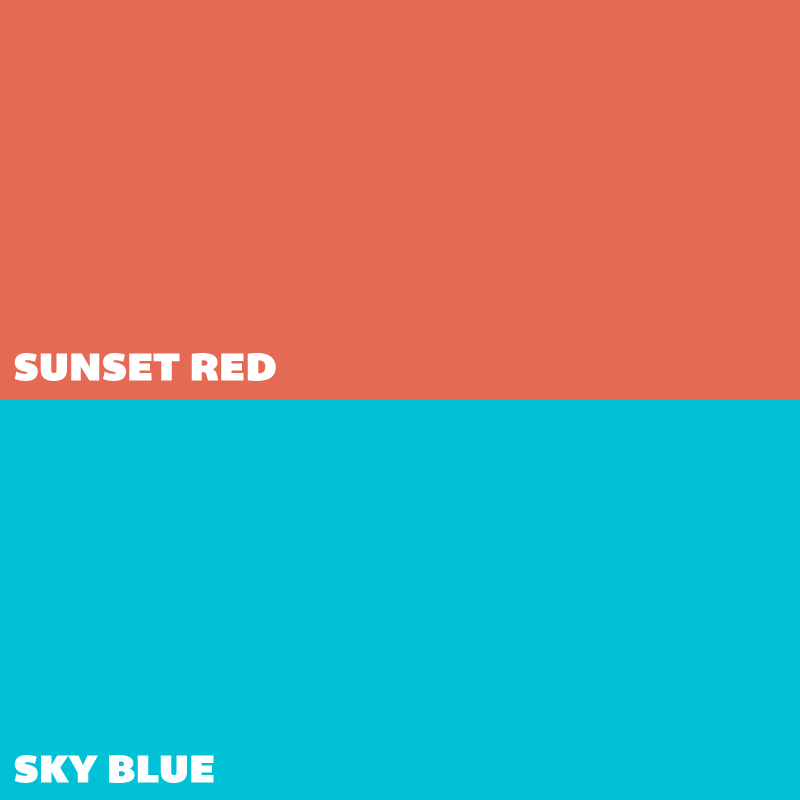

- Prussian Navy and Emerald should always be given top billing in any print or digital assets as these are our primary colors.
- Avoid using Emerald and Sunflower together as the contrast may be too low, and never use Emerald and Sunset in close proximity.
- Avoid using Sunflower and Sunset together as there is low contrast between the two.
When designing graphics, posters, print and digital materials for APF, keep in mind the following style suggestions:
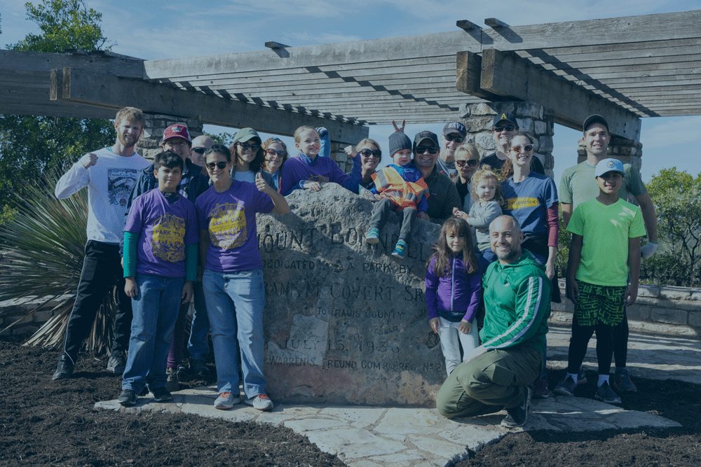
APF often uses transparent overlays on large photos. Prussian Navy at a transparency of 30-70% is preferable. Never use emerald as a transparent overlay on photos.
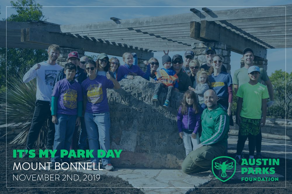
APF’s visual aesthetic is vibrant but clean. Use plenty of white space and keep backgrounds and borders simple. Thin strokes (.5pt to 1pt) for borders, as well as simple patterns are preferable.
The following are the fonts recommended for use on all APF print and digital materials. Fonts should be purchased or obtained through APF in order to be used legally.
Partnering with or designing for APF on a creative project? Send us an email for access to font files or any other font-related questions!
PRIMARY TYPEFACES
Bemio is our main display font and is great for headlines, and section headers. Use Bemio in all caps, title case and italics.
Brandon is our main body font and is best used for body copy, sub-headers, tagline, and section headers. Use it in all caps, title or sentence case in light, regular, medium, bold and black, as well as the italic versions of these weights.
DIGITAL TYPEFACES
OTHER TYPEFACES
APF often partners with other brands, organizations and businesses on projects and events. It is sometimes necessary to mix these brands by incorporating other typefaces into collateral materials.
It is always preferable to use APF fonts where possible, but when creating a co-branded piece, Brandon Grotesque is generally suitable for body copy and sub-headers so that other brand fonts may be used as headlines.
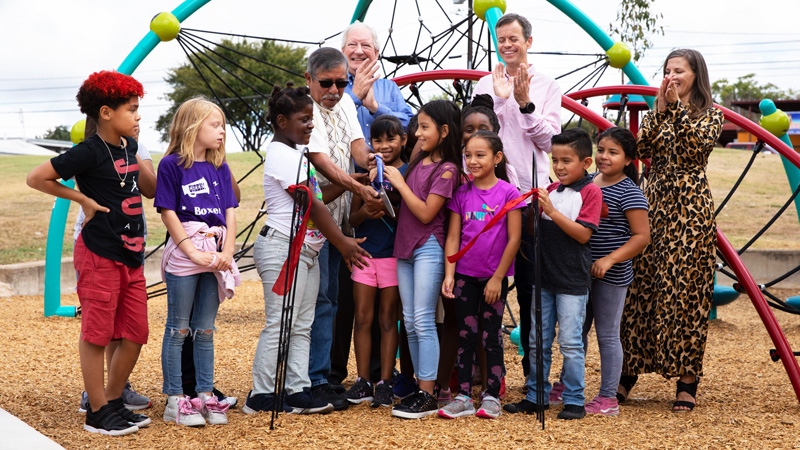
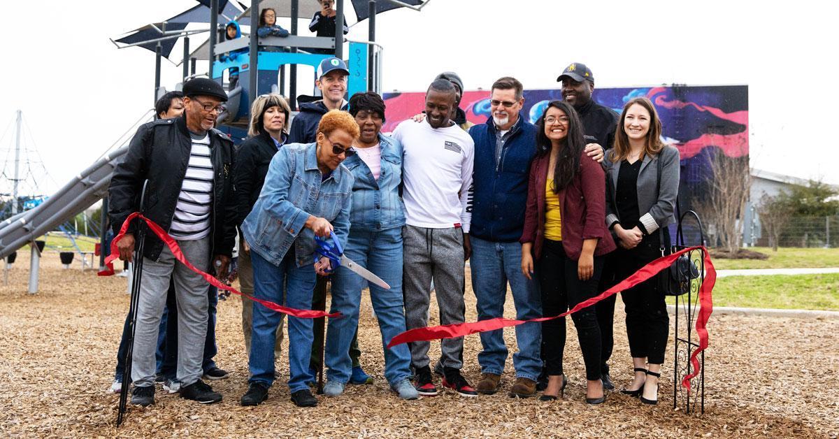
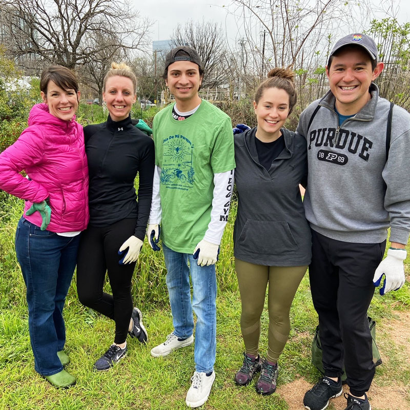
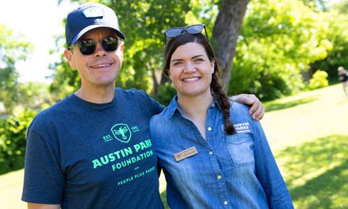
APF’s photography assets should always focus on people engaging in and having fun in parks. In order to showcase the work we do, and the positive impact we have on our community, APF uses high-quality, vibrant, large photos of people in parks for our materials.
Photos featuring people of all ages, races, abilities, and walks of life engaged in different kinds of positive park usage are encouraged. Active, vibrant, positive images make up our media library, so when shooting for APF keep our tagline - people + parks - top of mind. See our approved photography package for examples.
APF often uses video assets to showcase our completed projects, our brand and our mission. When shooting video for APF it’s important to capture the diversity of our parks and our community.
Again, keep our tagline in mind, and help us capture the positivity of our mission, impact of our work and the voice of Austin.
Though the main logo lockup is to be used wherever possible, APF does request these logotypes and lockups be used for specific programs and events.
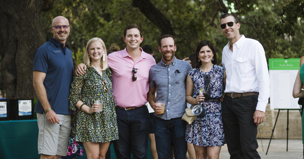
Groundbreakers are individuals, couples and families commited to increasing access to high-quality parks across Austin by pledging to make monthly donations. Generally, Brandon Grotesque, in all caps, and bold or black is used in Prussian Navy or white on a Prussian Navy background.
Additionally, this is the ONLY instance where text of any kind may be added to the inside of the shield. As with any APF branded item, approval is required before publishing. Requests for approval may be sent to marketing@austinparks.org.
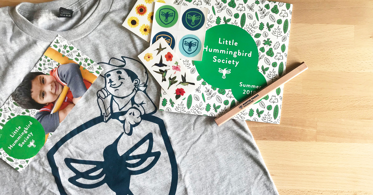
Little Hummingbird Society is APF’s kid-focused giving club and may be displayed in any of APF’s brand colors, depending on the season. Generally, Brandon Grotesque, in all caps, and bold or black is used in Emerald or white on an Emerald background with the full name of the program written out.
Additionally, this is the ONLY instance in which the hummingbird may be used outside the badge. As with any APF branded item, approval is required before publishing. Requests for approval may be sent to marketing@austinparks.org.

As one of APF’s longest-running programs, Movies in the Park uses the main APF logo lock up and Bemio to create this logotype. A vector version is available for download in our approved logo package. Movies in the Park should be written out in full. This logotype may be displayed in Prussian Navy, or in black or white in some instances.

Austin Park Foundation’s largest annual fundraiser, held in early October, uses a logotype mixing Chalet Comprime and Brandon Grotesque. The official logo for this event changes slightly year to year. Please contact marketing@austinparks.org for the most up to date version and colors.

Format: ZIP with Vector Files
Format: Online Drive
Austin Parks Foundation uses the Associated Press guidelines as our general stylebook. Please refer to the most recent Associated Press Style Guide for questions.
More information on the latest AP guidelines here: apstylebook.com
In accordance with our brand personality, APF uses a friendly, positive voice in all our communications. We want to be professional and knowledgeable, but approachable. While each of our communication channels, programs and events may have a slightly different feel depending on the audience, our overall tone and language should fit these guidelines.
Don't refer to us The APF, The Groundbreakers or any other permutations. Our name, our monthly giving programs, and our other programs are proper nouns.
Don’t refer to it as The Groundbreakers, The Foundation, or any other permutations. Think of it like Starbucks, which isn’t called The Starbucks. Or Trevor, not The Trevor.
There are many acronyms associated with our work, but the only public-facing acronyms we use (always spelled out on first use) are as follows:
- Austin Parks Foundation (APF)
- It’s My Park Day (IMPD)
- Parks & Recreation Department (PARD)
- Trust for Public Lands (TPL)
We often speak of parks, trails and green spaces - please note green space is two words.
Playscapes - one word - is our preferred general term for play areas, playgrounds, etc.
Omit “https://www.” when referring to a website in copy: Visit austinparks.org (note all lower case) for more information.
If a link is longer or more complicated than just austinparks.org/example, use an embedded or shortened link instead of writing it out.
Be clear and brief. Always make your language simple and easy to understand.


